This article is the seventh in a series about Gallup's latest LGBT survey, which I began publishing last month.
The series is the second season of LGBT by the Numbers.
You can find brief descriptions of the articles from the first season in its Table of Contents.
Over the past four years, Gallup has collected a wealth of data on LGBT identity in the United States.
We’ve examined Gallup’s LGBT data in a variety of ways.
This time, we’re going to look at specific LGBT identities, and examine the percent of each generation who identified with that identity, over the past four years.
While that might sound complicated, it will make more sense after we take a look at a few graphs.
LGBT Identity
Let’s begin by examining some graphs that have already appeared in this series.
First, we’ll take another look at LGBT identity, overall.
This graph, which first appeared in “Overview,” shows the percent of each generation that identified as LGBT in each of Gallup’s annual surveys since 2020.
All of the line graphs in this article were created using Flourish.
For each of these graphs, pay attention to the y-axis, because the scales of these graphs will vary significantly.
A few interesting observations can be easily seen on this graph.
First, it's worth noting that the values for Gen Z are significantly higher than the values for other generations.
Next, in
each annual survey, the generational pattern holds. Each younger generation has
a higher LGBT value than the one that came before.
Finally, the value for US adults overall is always between the values for Millennials and Gen X.
For each of the graphs in this article, I’m going to provide a close-up version with Gen Z removed, so readers can more easily see the values at the bottom of the graph.
For each pair of graphs in this article, I will also provide the table of values used to create them.
Next, let’s take a look at similar graphs for specific LGBT identities.
Bisexual
Bisexual is consistently the most common LGBT identity in Gallup’s annual survey.
We first examined the graph for bisexuals in “LGBT Identity by Generation.”
The values for bisexual Gen Z adults are consistently significantly higher than the bisexual values for other generations.
Let’s take a closer look at the values at the bottom of the graph.
The overall value for bisexual US adults is consistently between the values for Millennials and Gen X.
We see a nearly consistent pattern where each generation’s prevalence of bisexual identification is more common than the generation that came before.
The only exception is 2020, when 0.3% of both Baby Boomers and the Silent Generation identified as bisexual.
Gay
This graph shows the percent of each generation who identified as gay in Gallup’s annual poll.
As you can see the values are much closer together than they were for bisexual.
Gen Z is consistently first, followed by Millennials, and US adults overall.
The order of the remaining generations isn’t consistent.
You can more easily see the lines at the bottom, in this graph, which doesn’t include Gen Z.
Lesbian
The lesbian graph also shows values that are much closer together than the ones in the graph for bisexual.
Once again, Gen Z is consistently first, and Millennials are consistently second.
Here is our close up graph for the smaller values, excluding Gen Z.
US adults, Gen X, and Baby Boomers are jumbled together.
The Silent Generation is consistently last.
Transgender
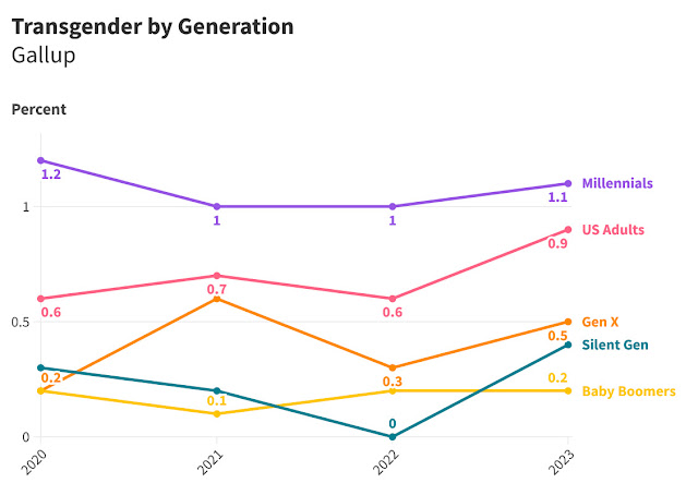
The following graphs show the percent of each generation who identified as transgender in Gallup’s annual poll.
Once again, these numbers are closer together than they are for bisexuals.
Gen Z is consistently first, followed by Millennials, and US adults.
In the close-up graph, we can see the values for Gen X, the Silent Generation, and Baby Boomers are jumbled together at the bottom.
Interestingly enough, in three out of the four years, the Silent Generation has a higher transgender value than Baby Boomers, although the values for either have always been less than half of one percent.
Volunteered Responses
Finally, let’s take a look at the volunteered responses not specifically listed in Gallup’s question.
Common volunteered responses include pansexual, asexual, and queer.
Gen Z generally has the highest rate of volunteered responses.
The only exception was 2020, when Gen Z had the same rate of volunteered responses as Millennials.
The close up graph reveals there is no consistent pattern in volunteered responses for the remaining generations.
I hope you found these graphs interesting. I know I sure did.
In the next article, we’re going to look at graphs for each generation, individually, and compare the percent of respondents in those generations who identify with specific LGBT identities.
That is the final article I have planned in our deep dive into Gallup’s LGBT data.
So join me next time as we continue our exploration into LGBT identity, by the numbers.


%20.jpg)


No comments:
Post a Comment